Bringing Clarity to a High-Intensity Betting Experience
2025
Client
Bahigo

Project overview
Sports betting interfaces are some of the most information-dense products out there. Odds shift by the second. Matches overlap. Users make rapid-fire decisions with real stakes behind them.
Bahigo had all the ingredients of a great sportsbook; depth, coverage, and features,but the experience needed to breathe. My mandate was simple: make everything feel clearer, faster, and more intuitive, without reinventing what users already trust.
Finding the Opportunities
As I mapped out the platform, a few themes emerged:
💡 Information was competing instead of collaborating
🖥️ Hierarchy wasn’t guiding decisions
💵 Critical actions like deposits felt heavier than they needed
⚽️ Live match views weren’t conveying urgency or momentum
These became the pillars of the redesign.

Design Direction
The approach centred on three ideas:
1. Clarity over clutter
More negative space, stronger grouping, cleaner visual rhythms.
2. Consistent patterns users can rely on
Odds, markets, and stats all follow a predictable logic.
3. A modern visual voice
Sharper contrast, calmer typography, and a UI that feels current without being disruptive.
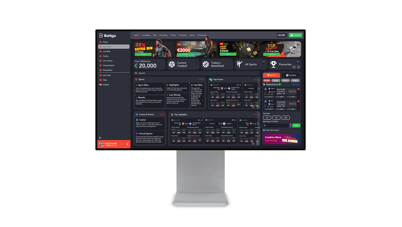
Dashboard
The homepage sets the tone. I consolidated promotions, strengthened the live section, and built a cleaner foundation for browsing matches.

Events Listing
Events move fast — the interface should keep up. Alignment, spacing, and colour cues work together to make scanning effortless, even when information density is high.

Outcome
The experience shifted from “busy but functional” to focused, trustworthy, and fast.
Users can now scan, decide, and act with far less friction — exactly what a modern sportsbook demands.