Case Study: Revamping Data Tables and Administration Dashboards
2024
Client
Shireburn Software
Studying the Existing Screens
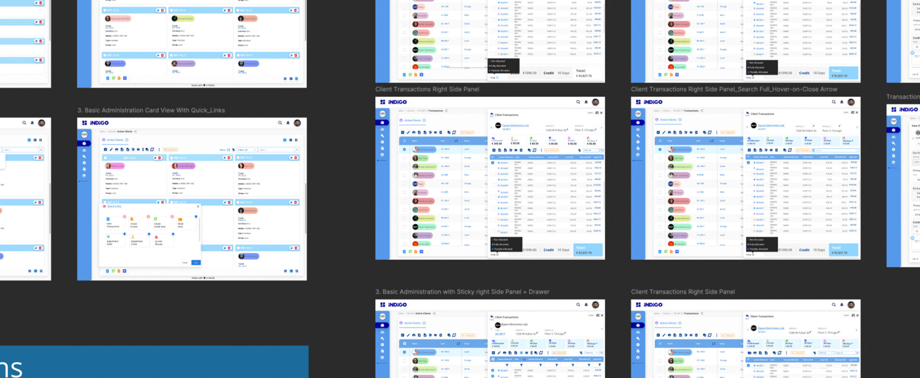
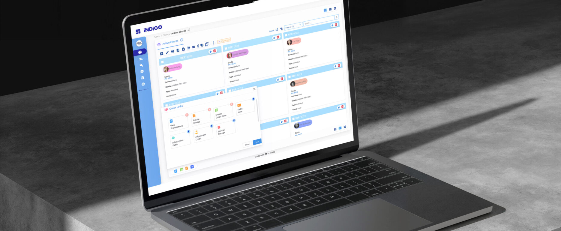
When I first joined this project, one of the biggest challenges was the inconsistent and outdated data tables across Indigo’s administration dashboards. Every module seemed to have its own way of handling filters, actions, and details, which created unnecessary friction for users and made training/support more difficult.
To start, I did a deep dive into the existing screens, paying close attention to:
-
How grids and filters were used differently across modules.
-
The pain points of modals and popups, which forced users to jump in and out of context when editing or reviewing details.
-
The visual overload created by flat data tables where everything looked the same, slowing down scanning.
-
Technology limitations, such as the existing design system components and front-end patterns that had to be respected.
I also spoke with stakeholders across product and support teams. They confirmed that inconsistent patterns often led to repetitive user questions (“Why can’t I filter this like in payroll?”) and extra training overhead. With stakeholder buy-in, I proposed a design direction that would standardise the experience across all modules while also making it more modern and user-friendly.
Previous Screens N.B. I did Not do this….

The Challenge
Workforce management is often plagued by complex interfaces and outdated processes. Employees need a way to clock in quickly, submit leave requests effortlessly, and access their payslips without frustration.
HR teams, on the other hand, require real-time visibility into employee attendance and compliance metrics. The challenge was to design a mobile-first experience that balances simplicity, efficiency, and accuracy.
My Role
As a UX Designer, I led the research, wire-framing, prototyping, and user testing for Indigo Mobile. My goal was to create a frictionless experience for employees clocking in, managing their schedules, and staying informed about their payroll—while ensuring that businesses maintain compliance with labor laws.
Research and Insights
To understand user needs, I conducted:
- User Interviews: Spoke with employees and HR managers to identify pain points in existing systems.
- Competitive Analysis: Analyzed industry-leading workforce management apps to benchmark usability and features.
- Usage Data Review: Examined Indigo’s web-based analytics to determine the most-used features that should be prioritized for mobile.
Key Findings
Speed is everything – Users expect clock-ins to take less than 5 seconds.
Visibility matters – Employees want a clear view of their schedules, leave balances, and payroll.
HR teams need control – Managers require quick oversight of attendance records to ensure compliance.
Design Process
Wireframing & Prototyping
I started with low-fidelity wireframes, focusing on user flows that minimized friction. After validating concepts, I moved to high-fidelity interactive prototypes, refining interactions based on user feedback.
Core Features & UX Enhancements
- One-Tap/ Slide Clock-In & Clock-Out
- Leveraged GPS and biometric authentication for secure, seamless attendance tracking.
- Designed a floating action button for quick access, reducing steps from 5 to 2.
- Smart Leave Management
- Simplified leave requests with a calendar-based UI.
- Integrated real-time leave balance updates to eliminate guesswork.
- Instant Payroll Insights
- Designed a dashboard-style payslip view for at-a-glance salary breakdowns.
- Enabled push notifications for salary deposits and tax updates.
- Accessibility
- Accessibility helps everyone and it also empowers people to have normal lives. I conducted user research and conducted lengthy meetings with users who are impaired to iron out improvements that could benefit this section of our user base.
Retrospective
Iterative Testing
Using usability tests and A/B testing, we optimised workflows, reducing clock-in time by 40% and increasing successful leave submissions by 70%. User satisfaction scores improved significantly, reflecting the impact of streamlined design choices.
Outcome & Impact
- Adoption Rate: 3x faster adoption compared to previous web-based workflows. Increased user adoption from 1000 to 10,000 users in 3 Months (and still growing)
- Efficiency Gains: Reduced payroll and attendance-related queries by 25%, improving HR and support team’s productivity.
- User Satisfaction: Increased engagement and positive feedback on the app store.
Takeaways & Next Steps
This project reinforced the power of simplicity and task-focused design in enterprise applications. Moving forward, I aim to enhance Indigo Mobile by integrating AI-powered attendance predictions and customisable employee dashboards to further streamline workforce management.